Designing cooperative technology
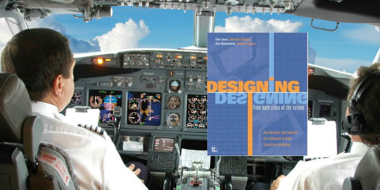
Designing from Both Sides of the Screen: How Designers and Engineers Can Collaborate to Build Cooperative Technology
by Ellen Isaacs and Allen Walendowski
Designing from Both Sides of the Screen introduces the Cooperative Principle for Technology: don’t impose and be helpful. Authors Ellen Isaacs and Allen Walendowski begin describing the goal of user interface design with the concept of flow; specifically, the lack of interruptions for a given task or activity. They use “tolerance capital” to describe the amount of times an application or interface can block you from your goal before you become annoyed or give up. To achieve the goal of minimal imposition, the designers must respect physical effort (clicks, mouse movements, button pressing) and mental effort (remembering, discovery, reading, understanding). Moreover, the designers must help the person using the product or service by providing context, explanations, messages, and status indicators.
Their diagnosis of the problem plaguing technology is that the number of features delivered is the metric of success rather than the usefulness (or usability) of the product. Additionally, the engineering mindset is geared to build for edge cases, which can result in experiences like the over-protective “are you sure you want to _____?”
Although the book was written in 2002 , before the mobile explosion and social media, the authors draw on many great examples of good and bad design. At the time, the Palm Pilot was an example of sparing user interface design given the great care that was given to minimal clicks.
Treat clicks as sacred
Rebooting is the mother of all clicks.
The book is full of examples where designers introduced too much friction by not thinking through interactions. It’s the death by a thousand cuts for an end user and will lead to product abandonment as soon as an alternative presents itself. Success here requires the product designers to obsess over every interaction and be as economical and spare as possible with their requirements of the end user. A reboot, they say, is worth 100 clicks because once the system is shut down and restarted, the user must work hard to restore it to its previous state.
Not all clicks are the same. In order to preserve the user’s physical effort, reduce clicks which require aiming and positioning. Scrolling and holding the mouse button increases time and mental focus.
Any physical action like a button press, swipe, touch, or voice control should be considered a “click” and should be used in the interface with care. Keyboard and mouse combinations, multiple keystroke combinations, and click and hold actions with mousepads or trackballs can all add up to a lot of physical effort. Shifting hand position from keyboard to mouse also adds up.
Conserving clicks extends to reducing the amount of input a user must give the system–be smart about what you ask (and don’t ask them to repeat themselves):
- Remember where they put things – The application should be in the same state when the user returns as the last time they used it.
- Remember what they told you – “Think about how embarrassing it is when you realize you’ve just asked someone a question they’ve answered before.”
User preferences
…users do specify their preferences all the time in the ways that most applications ignore.
Although much effort is spent on implementing preference centers, many user preferences can be gathered by paying attention to what the user just did.
You should assume that almost no one will change Preferences that modify the system’s behavior…focus on the common case for most people, not what some people might want to do in some situations.
Treat user interface elements sparingly
Like clicks, user interface elements should be added to the experience when necessary. User interface elements are opportunities for more user actions and can easily overwhelm.
- Make common tasks visible; hide infrequent tasks – “Agonize over every visual element on the screen. The more there are, the fewer that get noticed.”
Give feedback
It turns out that people perceive the entire process faster if they can watch it as it occurs rather than seeing the final result all at once, even if it takes the same amount of time.
Progress and indicators are a surprisingly under-utilized way to communicate with end users. Showing the number of steps in a process and indicating the current step is a common feedback paradigm.
Make clear the consequences of user actions. If a button is pressed or something is selected, the user should know right away that this has happened. A common frustration is taking an action, but not knowing whether the command or selection was recognized by the system.
Create “widget less features”
This principle encourages designers to expose less interface to the end-user. There is no shortage of examples of software packages which implemented a widget or button for every possible function and interaction a user may want to perform. This approach makes discovery difficult and does not provide the end user with context for their goals. Endless menus and lists of options decrease usability by hiding important features.
Solve problems
Don’t blame the user or another system–don’t pass the buck. The book gives the example of AOL messenger which basically quits if there is a connectivity error. In contrast, the Yahoo! instant messenger changes its status to an error condition and continues to attempt connection.
Software should provide resilience and transparent status when errors or unexpected conditions occur. Stopping the user in their tracks will not lead to repeat usage. The solution to common errors or failures in dependent systems can be providing information and guidance to the user up front. This can assist in troubleshooting and easier operation of the product or service.
In this TED talk, author Ellen Isaacs discusses ethnographic research as a way to discover problems and design opportunities. She reviews the history of computer human interfaces and shows a video of one of the first usability studies conducted. A team at Xerox PARC filmed computer scientists attempting to make copies on a large photocopier. Their first attempt completely fails. She then shows her own team’s study of parking signs and develops some ideas for more clarity and usefulness.
[youtube http://youtu.be/nV0jY5VgymI]